Since starting my freelance practice, I’ve created a range of illustrations, posters and visual pieces for different contexts and ideas.
This is a selection of my illustration work, projects that explore composition, colour and visual storytelling in different forms.


illustrations and branding
〰️
illustrations and branding 〰️
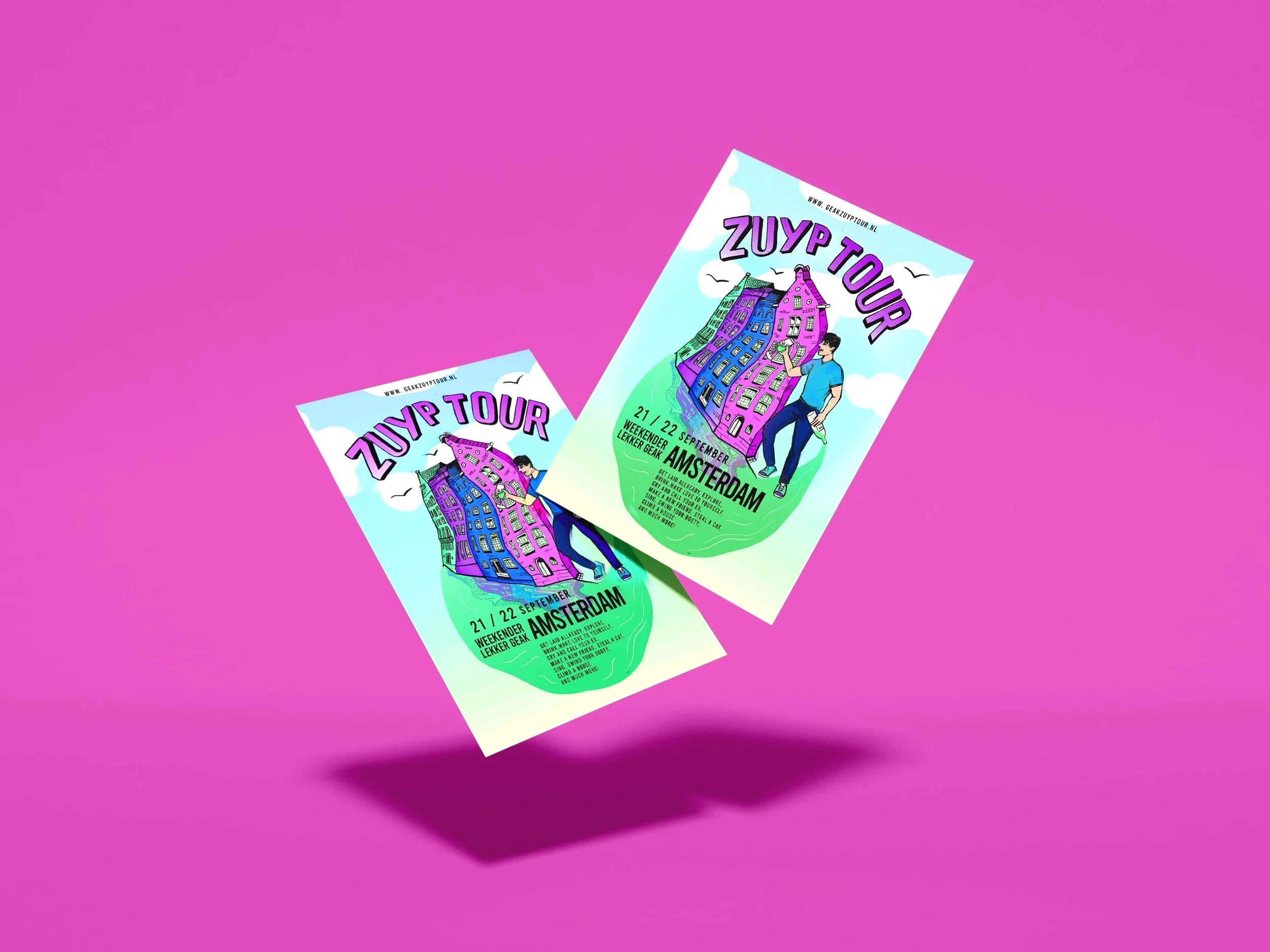
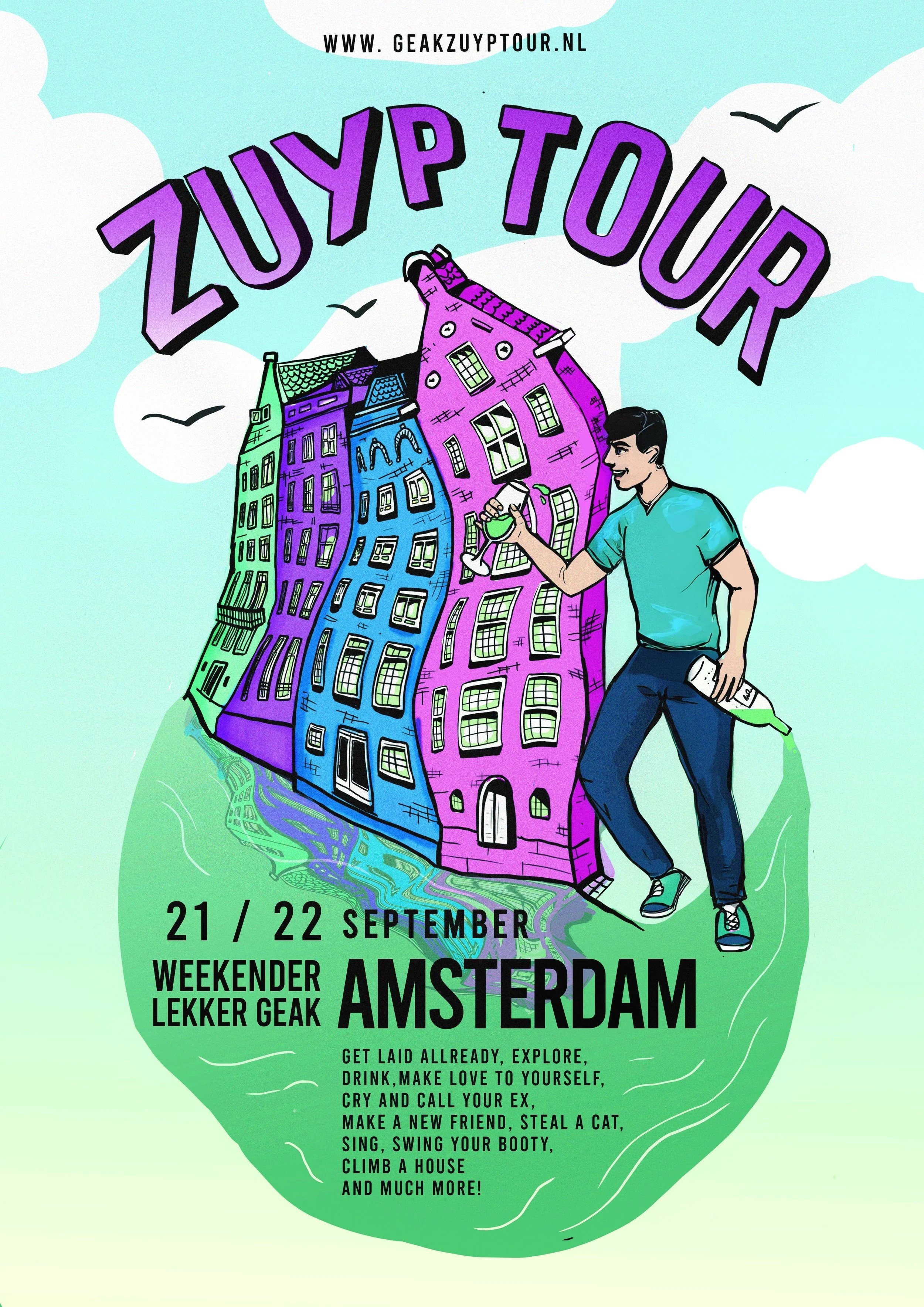
Zuyp Tour
For Lekker Geak I was commissioned to illustrate a poster for the “Zuyp Tour”. Wishes for this assignment were; colorful, crazy, cartoon style and easygoing.


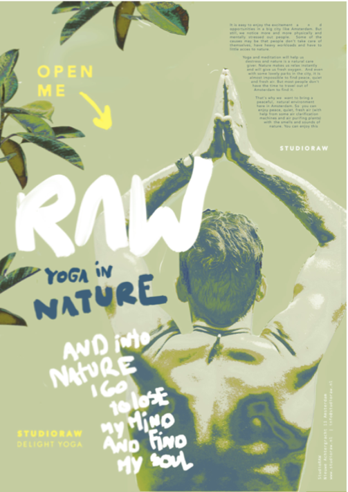
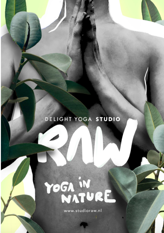
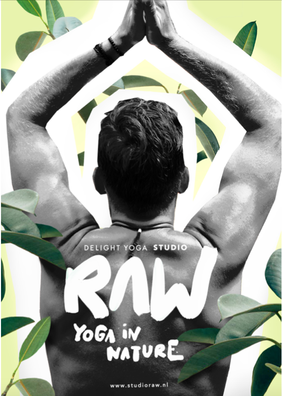
RAW yoga
Campaign

RAW brings together yoga and nature, offering urban professionals a moment of calm and reconnection. A studio experience inspired by natural elements, textures, and immersive rituals, creating space to breathe within the city.
Assignment to develop a new concept for Delight Yoga.

Webdesign
A NY BASH festival
For NY I got the assignment to make illustrations to make a festival house map and line-up. They wanted to organize a festival setting in home. I designed illustrations and font in line how the festival presented itself at the house, but little abstract twists. They’re both presented as
posters and folders.


Lidmaatschap product illustraties
For Berghuiserpont, I was responsible for the concept and full execution, designing a unified collection of visual elements and membership passes.


Dagelijks
Basic lidmaatschap.
“Altijd op de hoogte van de ontwikkelingen in je vak”
Persoonlijk
Basic lidmaatschap + meer (communicatieve) mogelijkheden.
”Kies zelf de terreinen van doorontwikkeling binnen je vak”

Professioneel
Lidmaatschap voor professionelen.
“Verdiep je vakkennis met duiding en achtergronden”

Expert
Uitgebreid lidmaatschap. Bedoelt voor ontwikkeling.
” Ontwikkel jezelf voortdurend”

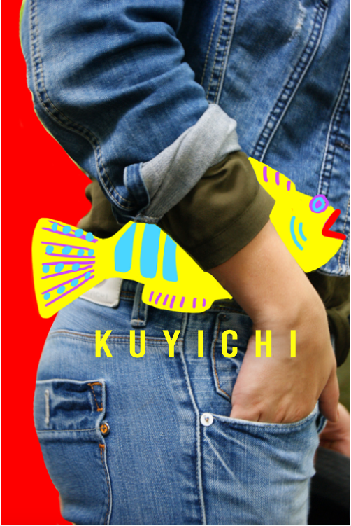
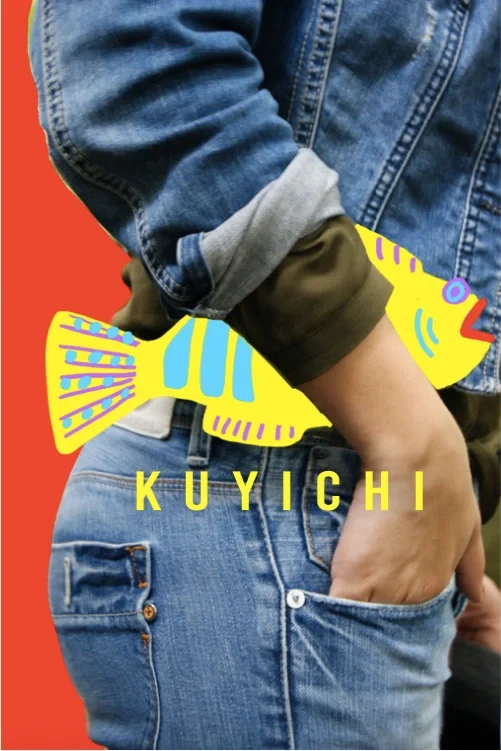
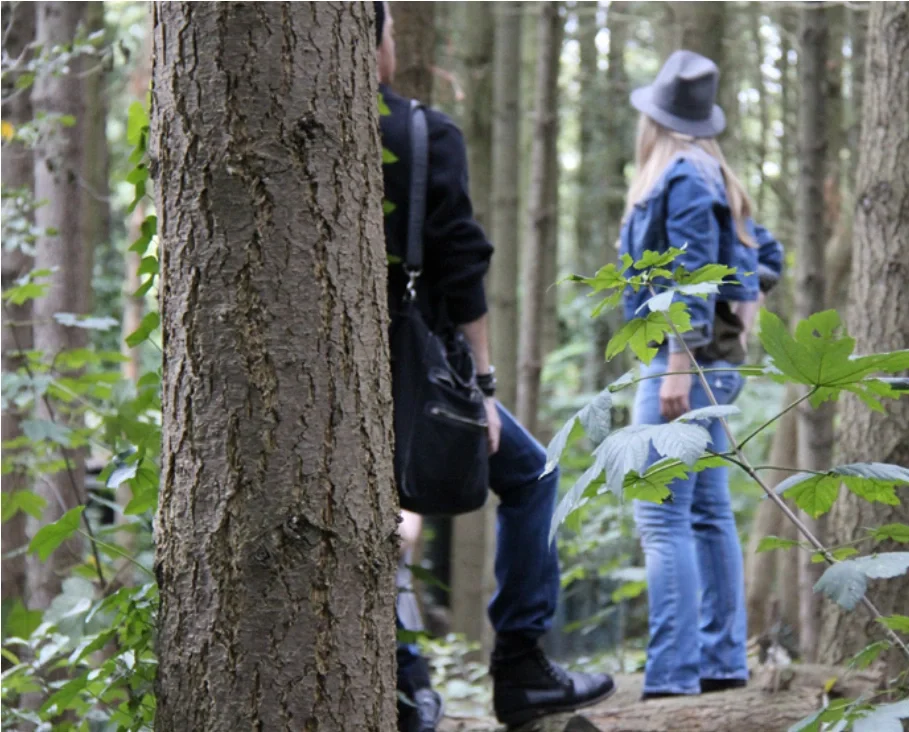
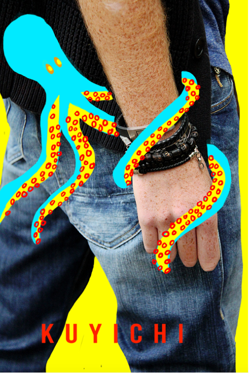
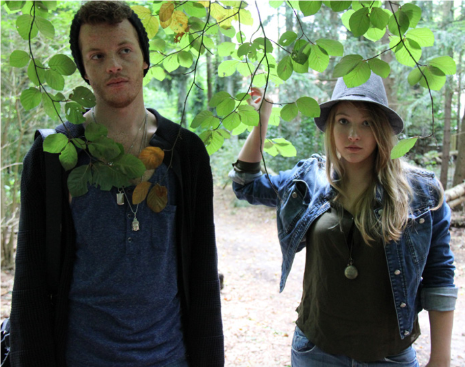
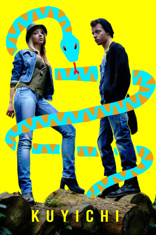
Kuyichi photography and illustrations
Assignment to develop images and photos for a kuyichi folder. This concept was; nature-friendly, youthful and fresh. We developed the photos together, then I created the illustrations for a few images based on the concept.

Rebranding
Maxwell menu
Inspired by Maxwell’s stone diagonals and roaring-twenties logo, the design blends old-school character with modern elements in warm, dark tones — a true neighborhood café.
As the living room of Amsterdam East, it attracts a broad and ever-changing audience.
The challenge: refresh its slightly dusty image without losing its roots.


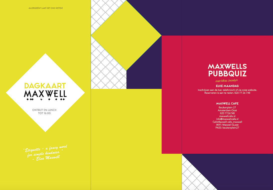

The logo’s character is preserved through consistent use of its twenties-inspired typography, while refreshed colors give the brand a new energy.
Reflecting Maxwell’s eclectic mix of people and interiors, the new identity embraces a structured “mishmash” of bold colors and geometric patterns, led by the diamond motif. Modern elements attract a younger audience, while the logo and type ensure continuity for the broader crowd.