Accessibility & contrast
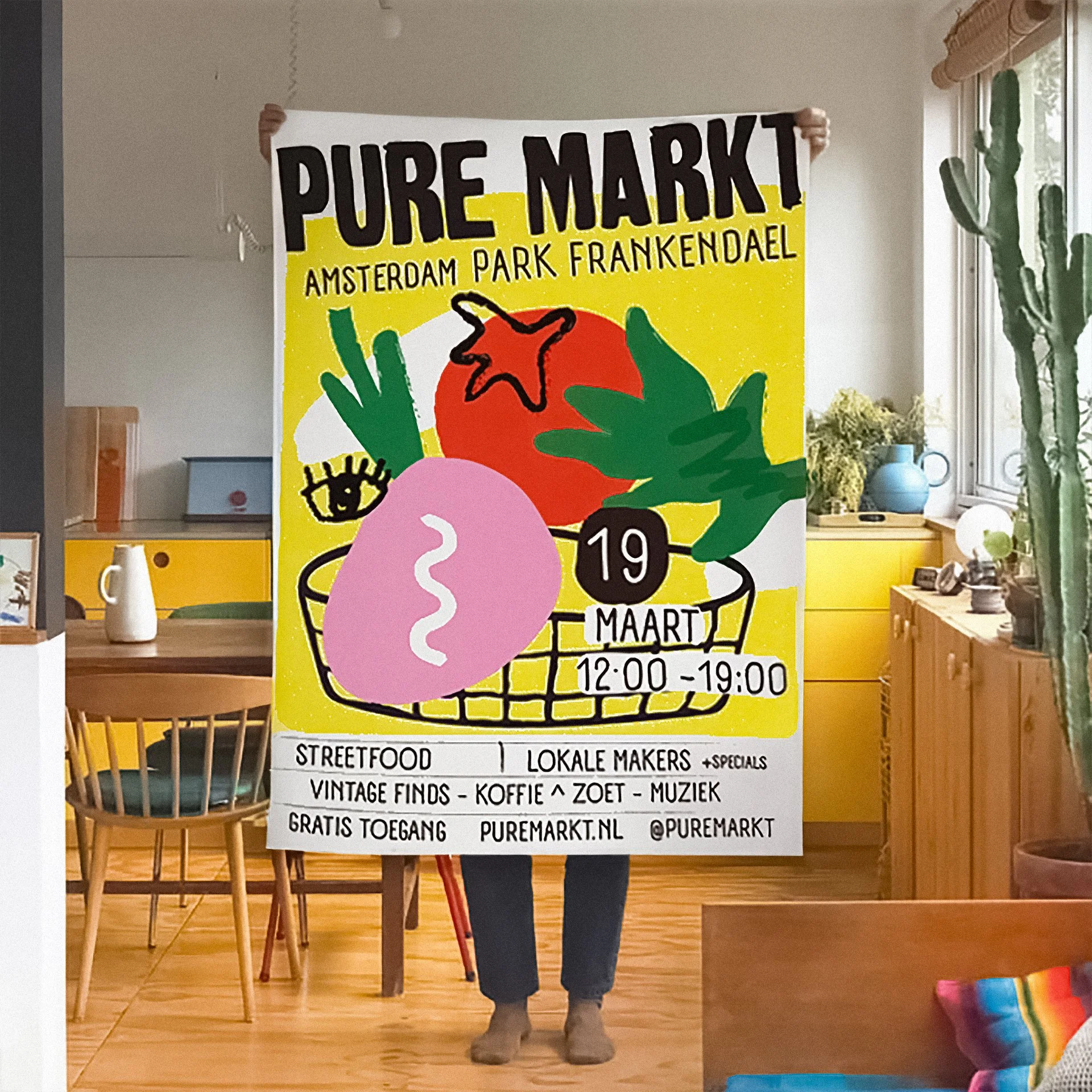
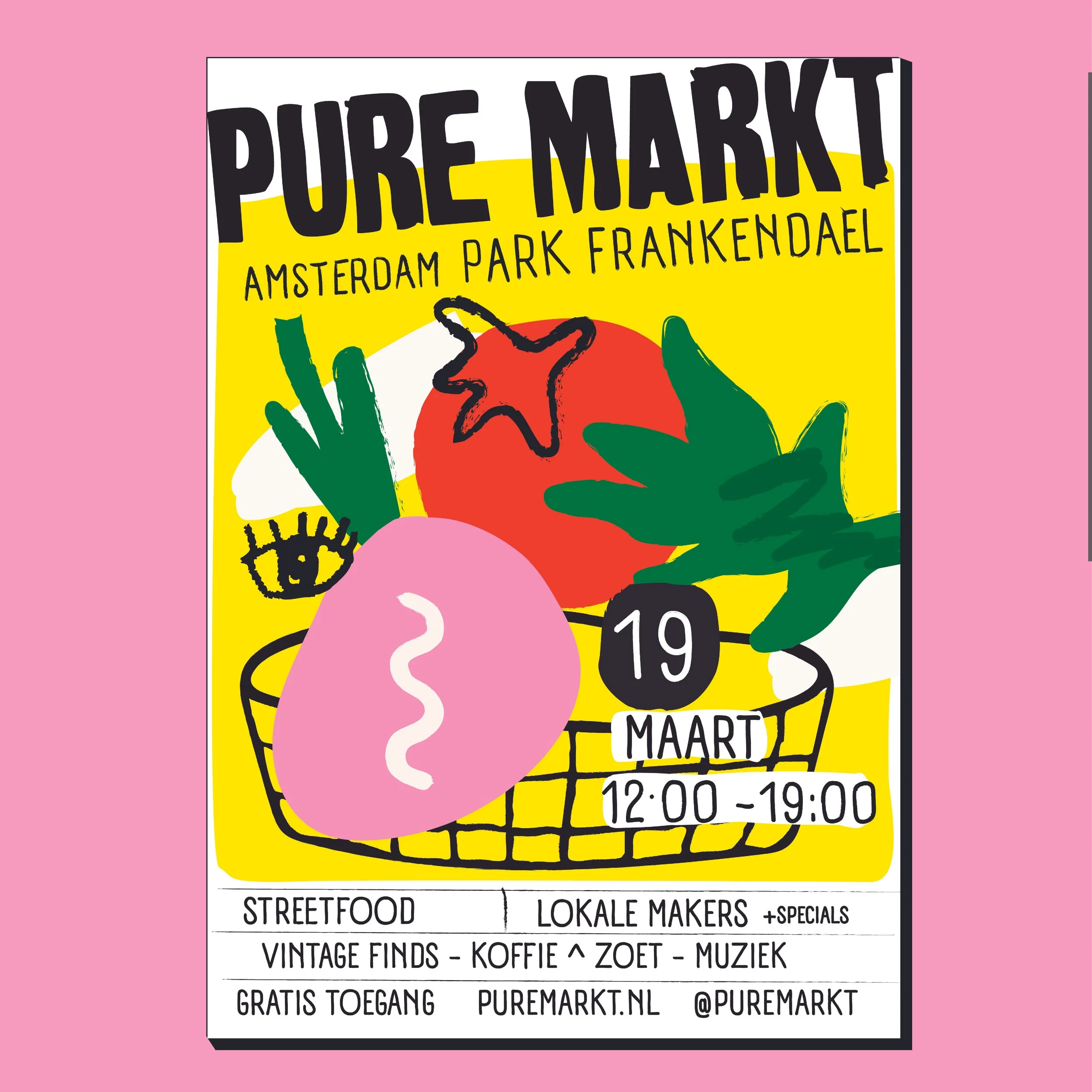
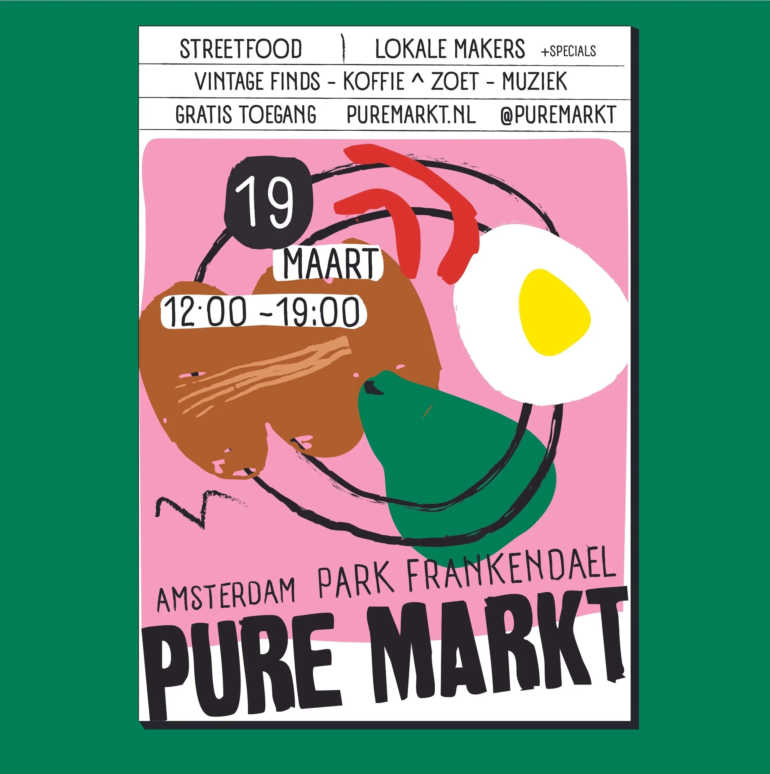
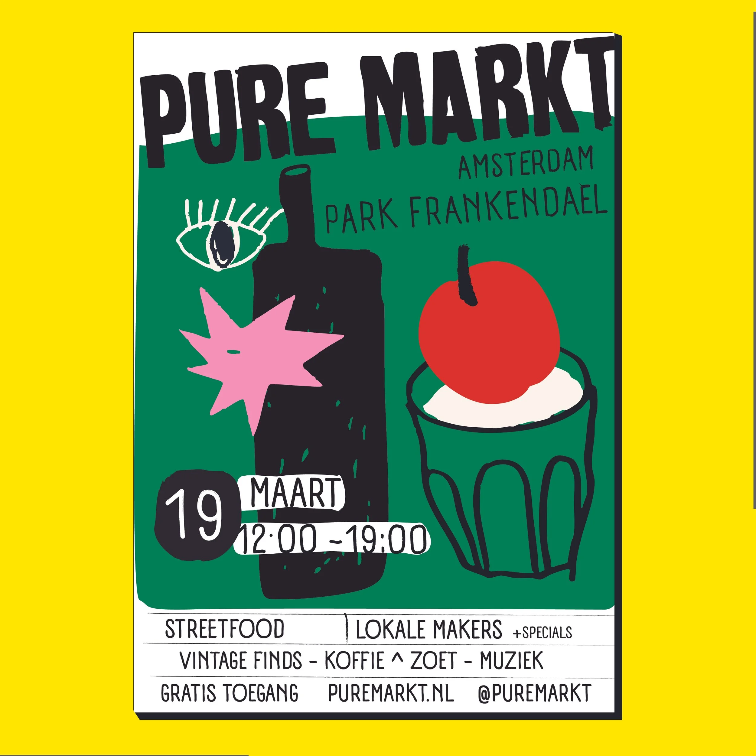
For Pure Markt (Amsterdam Park Frankendael), I designed a vibrant and playful poster capturing the energy of the event. The market brings together street food, local makers, vintage finds, and music — a relaxed day in the park centered around community and discovery.
Visual approach
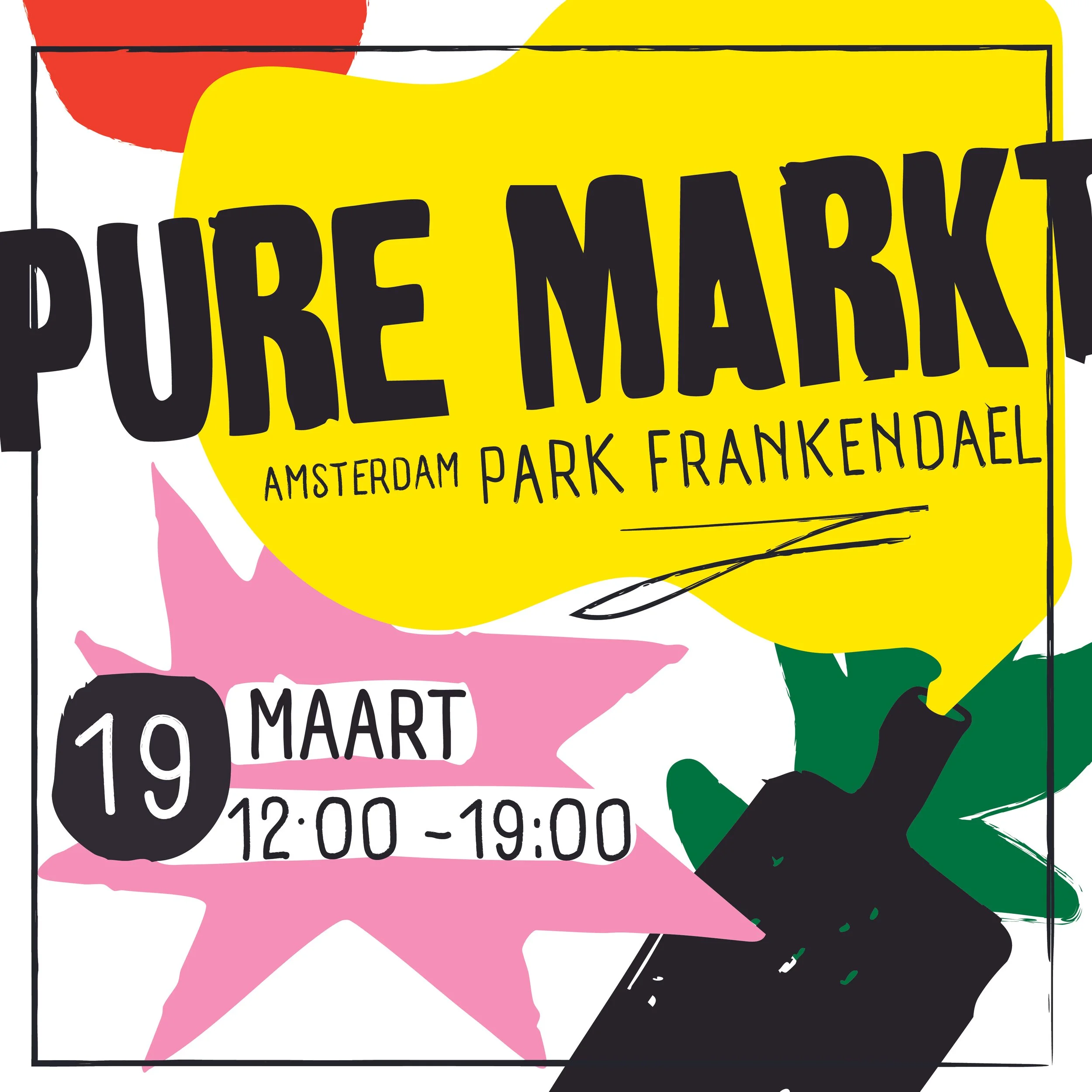
Instead of a polished or minimal aesthetic, I chose a hand-drawn, almost naïve visual language. Bold color blocks, expressive lines, and an intuitive composition create a sense of spontaneity and warmth. The poster feels alive — mirroring the dynamic atmosphere of the market itself.
Project context
The playful illustrations make the event approachable and accessible, while the strong contrasts ensure it stands out in public space.
A visual identity that feels human, energetic, and inviting.
An open-air market in Amsterdam where local vendors, food stands and visitors meet for a day in the park.