Virtuagym
UI design
contact page
Improving user flow and support accessibility.

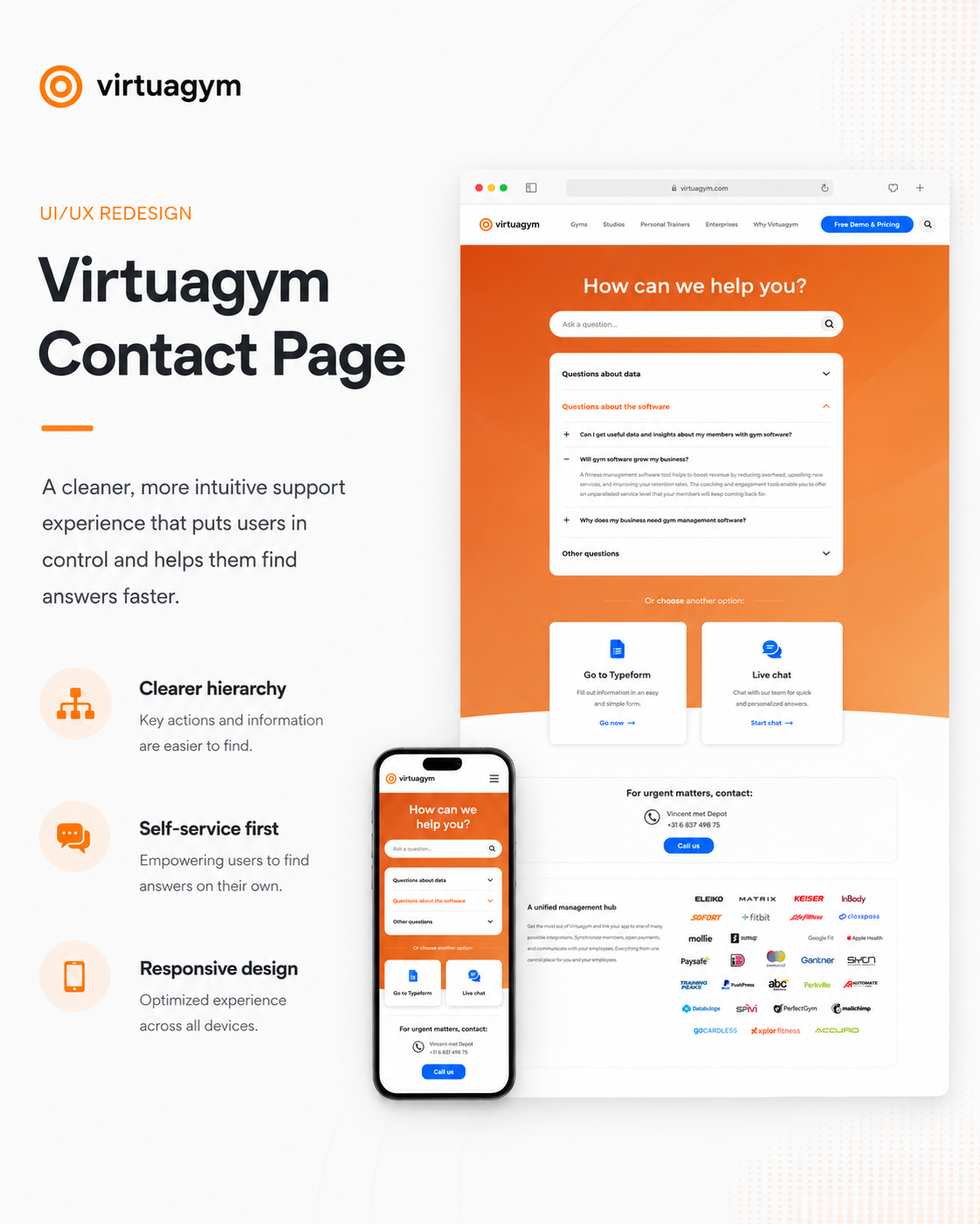
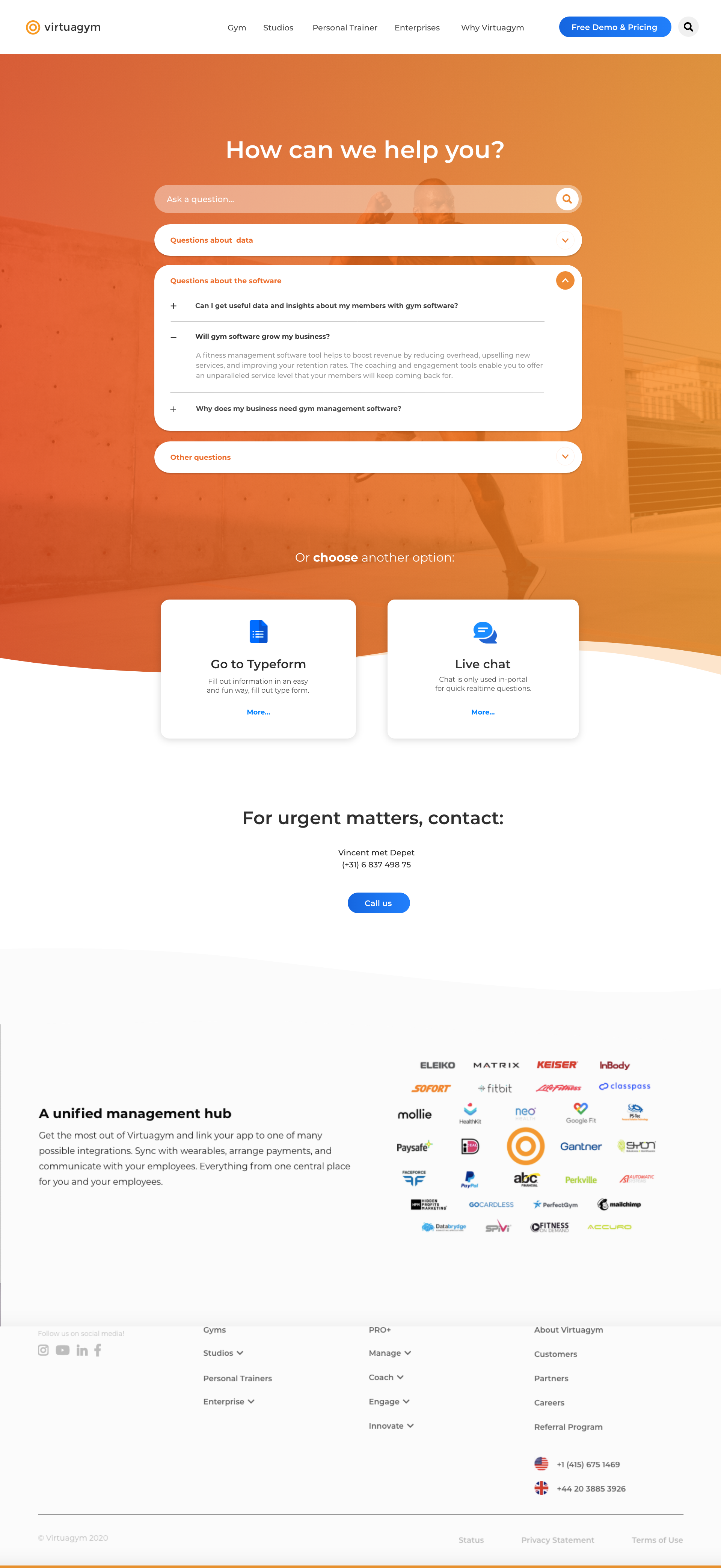
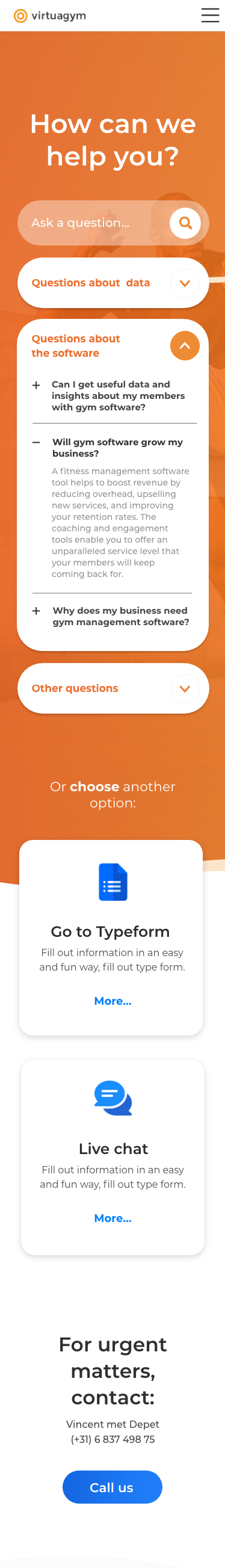
For Virtuagym, I redesigned the contact page to create a clearer user journey and make support easier to navigate.
The “How can we help you?” section acts as the main starting point, with a prominent search function and clearly structured support categories. Typeform and live chat are visually prioritized, while urgent contact details are placed lower on the page to encourage self-service first.
A wavy orange header, gradient imagery, and matching footer strengthen the visual identity and create a more consistent Virtuagym experience.

UI/UX Design: Extending
a Content Platform with
E-commerce
New branding
for webshops

For Berghauser Pont Publishing, I designed an extensive webshop as an extension of the existing Omgevingsweb platform. The goal was to introduce a clear and intuitive purchasing flow without disrupting the platform’s professional and content-driven character.
The main challenge was balance. Omgevingsweb is information-heavy and trusted by legal and policy professionals. The webshop therefore had to feel like a natural layer within the existing system, not a separate commercial environment.

I focused on clarity, hierarchy and restraint. A structured grid, generous whitespace and consistent typography support readability, while subtle but distinct CTAs guide users through discovery, evaluation and purchase. The existing color palette was maintained to preserve brand recognition, with accent colors used functionally for interaction.
The result is a modular and scalable e-commerce experience that integrates seamlessly into the platform, supporting both editorial authority and transactional clarity.


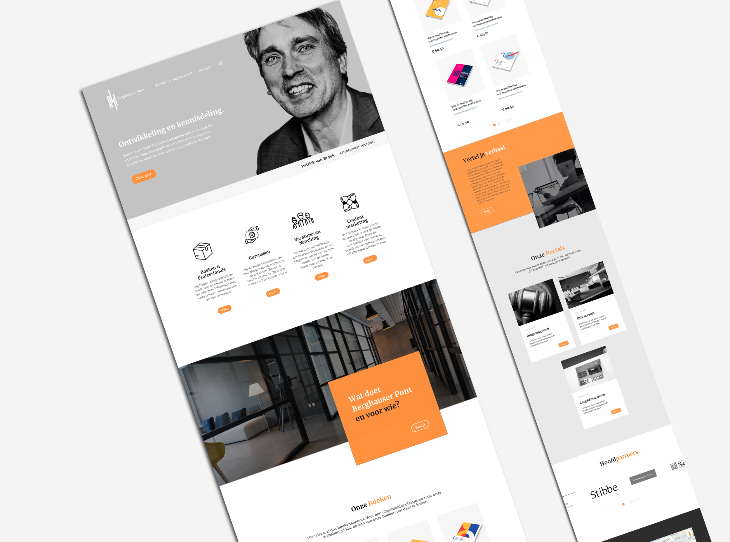
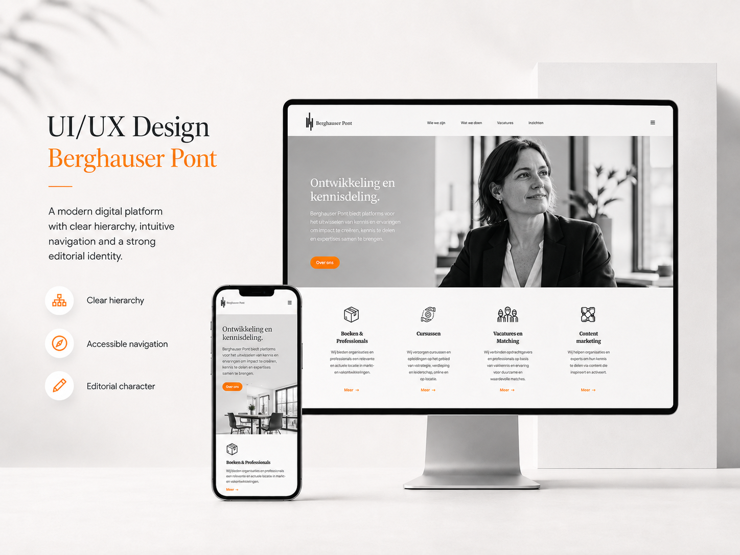
For Berghauser Pont, I developed a refined web design that strengthens the platform’s professional identity while giving it a more contemporary feel.
The experience is built around clarity and focus. The header — where authors are presented — acts as the visual anchor of the site. From there, the interface unfolds in calm, layered shades of grey, creating a neutral and balanced foundation. This restrained palette allows the content to lead, while maintaining a cohesive and confident appearance.
UI/UX & Web Design for Berghauser Pont
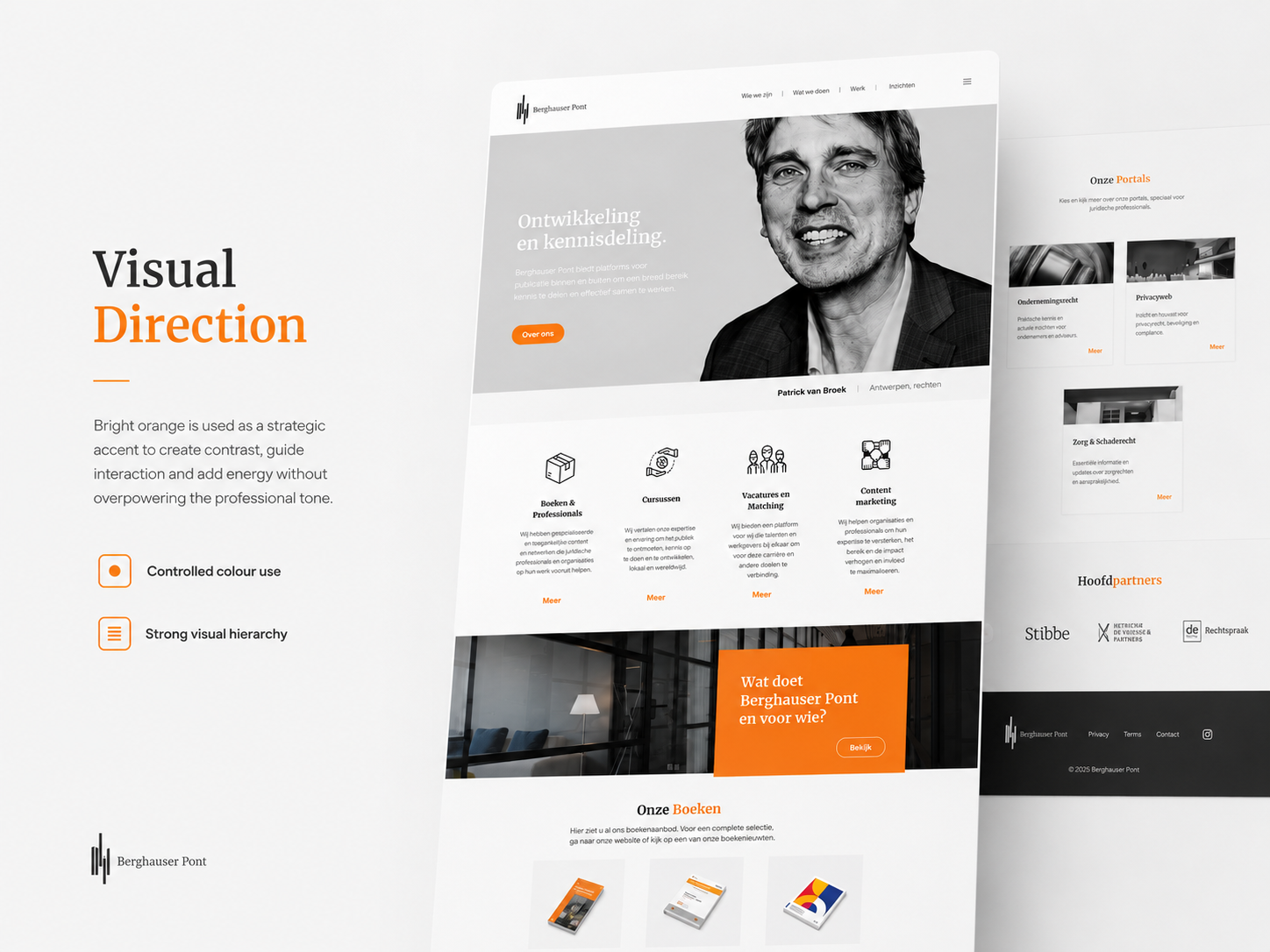
Bright orange is used deliberately as an accent. It introduces contrast, guides interaction and adds subtle energy to the interface without overpowering the professional tone. The combination of clean surfaces, controlled color use and clear hierarchy results in a modern, accessible website that feels both authoritative and visually strong.
The design balances graphic refinement with UX clarity — supporting content, guiding users naturally through the platform and reinforcing the identity of the publisher in a consistent and elegant way.


Webdesign

Mobile webdesign